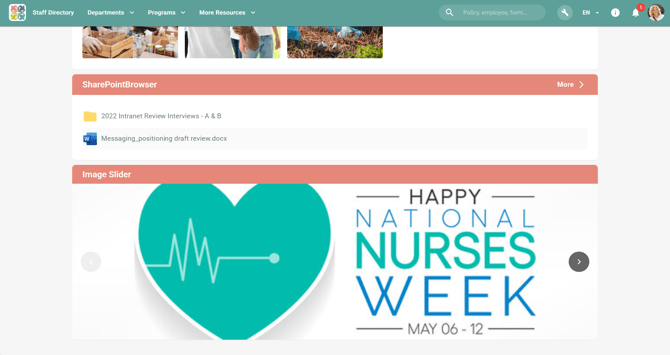
Add an Image Slider
1. Edit current page
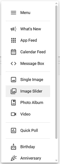
2. Add a section
3. Add a widget, and select Image Slider
Widget Settings
The Image Slider widget provides the following configuration options:
Widget Header: Toggle to show or hide the widget title. This option allows users to create cleaner, more focused displays for banner-style content.
Auto Cycle: Toggle to enable automatic cycling between images. When enabled, images will transition automatically using preset timing settings.
Image Upload: Upload up to 10 images maximum. Images are displayed as expandable panels that can be reordered by dragging. The maximum file size per image is 30MB.
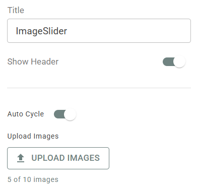
Image Properties
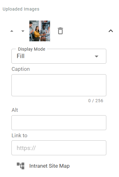
Each image in the slider can be configured with the following properties:
Image Cropping: The Image Slider includes a manual cropping tool that allows users to precisely control which portion of an image is displayed. This is particularly useful when you want to focus on a specific area of an image or adjust how it appears in the widget.
Image Fitting: Images are automatically center-clipped to fill the widget space based on the selected section height. For smaller widget width or mobile views, images default to a fill mode that center-clipped the image to maintain the aspect ratio.
Caption (Optional): Add descriptive text that appears at the bottom of the image. Character limit applies.
Link (Optional): Add an optional URL to make the image clickable. The link can point to an internal page or external website.
Alternative Text (Optional): Provide alt text for accessibility purposes. This field describes the image content for screen readers. The caption text will be automatically copied to this field by default.
Change the image order: Click on the up and down arrows next to the image to reoder.
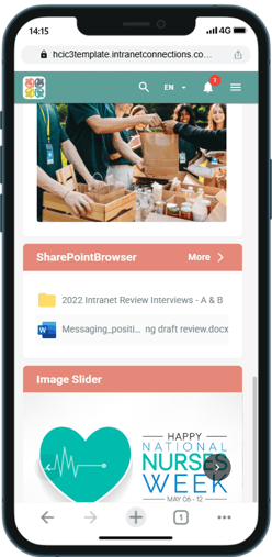
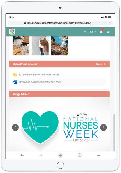
Display Behavior
Navigation: Arrow controls appear on the left and right sides when multiple images are present. If only one image is uploaded, navigation arrows will not display.
Responsive Design: Images automatically adjust to different widget sizes and screen sizes (desktop, tablet, mobile).